Channeling traffic to your Shopify store is great and all. For many online store owners, that is another entry in the win column. But what good is traffic to your Shopify eCommerce store if it isn't converting?
The resources you pump into generating traffic for your store can be better spent on converting visitors already there. We're not saying you should abandon your traffic generation efforts. On the contrary, marrying these efforts with a conversion strategy works wonders for your store. After all, an increased conversion rate also increases traffic in the long run.
In this article, we're showing you how to build a high-converting website. We'll go through the different areas that need attention and how they can make your store profitable. Let's Dive in.
How To Increase The Conversion Rate Of Your Shopify Store
Creating a high-converting website is essential when building a successful eCommerce brand. However, achieving this isn't quite so straightforward. You have to implement several measures to take advantage of the traffic that finds its way to your site. Here are a few tips you can use to increase the conversion of your Shopify eCommerce store.
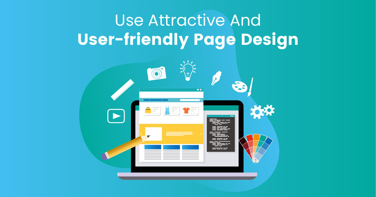
Use Attractive And User-friendly Page Design

Your store's design should be able to attract and retain visitors. Use brand colors and design elements that catch the eye and pique the interest of would-be customers. For example, the store's homepage should clearly and prominently display elements that identify your brand. These can be high definition photos and images and/or text. That's just the visitor's introduction to the site. To reel them in further, you need to ensure that they can move through the store with ease. A customer can always ask a clerk for something that they're looking for in a physical storefront. On the other hand, a visitor in an online store doesn’t have anyone nearby to show them around.
Therefore, you need to ensure that you have an intuitive navigation process. In other words, browsing through the website should be second nature to the visitor. Every element should make sense to find what they're looking for without jumping through any hoops. One way to ensure this is to display navigation links in the header of the page. This allows customers to find whichever section they're looking for. Additionally, you can add a search bar so that your site's visitors can input whatever they're looking for. This helps them find it more easily if they don't know which categories to look through.
Take Advantage Of Different Call To Actions
Call to action (CTA) buttons are the bread and butter of your Shopify eCommerce store. They prompt a would-be customer into becoming a buyer. The most common - and perhaps most important - CTA for online stores is "Add To Cart". Display this CTA button on your product pages in a prominent position. Using a different color sets it apart from the other content on the page. This means that it catches the eye of potential buyers more easily. While the buying CTA achieves the ultimate goal of your Shopify store, you can capture conversions using other forms of call to action. Sometimes, you want to make sales of a particular object and also get visitors' contact information. This is usually an email address. Known as a lead, this information allows you to keep marketing to that visitor even after they have left your online store.
So, instead of filling every page on your store with "Add To Cart" buttons, you can display lead capturing CTAs. Of course, a significant number of visitors won't fork over their personal information. Therefore, you need to give them an incentive to leave their email addresses. Discounts or free material are great ways of getting leads. You can also convert visitors into leads by displaying CTAs to subscribe to your newsletter. You can also prompt them to create an account on your site. While all these don't necessarily turn into immediate sales, you can convert the leads into sales down the road. And by that time, you are likely to have generated enough interest in your brand and products to create repeat buyers.
Make The Checkout Process As Easy As Possible
One of the main draws of online shopping is the convenience it provides. Therefore, even the slightest inconvenience can make the shopper abandon a cartful of your products. Don't waste all the work you put into designing a beautiful Shopify store and smartly displaying CTAs by making the checkout process difficult. Even by a small bit. How can you make this process smoother? For starters, display the order summary. This makes it easy for the customer to see how much they're spending. Also, this prevents them from going back to see what they've bought. There's a big chance that they'll get distracted and not finish the checkout process.
The issue of shipping fees also usually creates a problem during checkout. Display shipping fees clearly so that the buyer knows what they're spending. Better yet, if you can, waive the shipping costs. Additionally, provide several payment options. If customers don't find their preferred mode of payment, they aren't going to sign up for one just to transact on your site. As a result, they aren't coming back to your Shopify store.
Add user-generated content to your Shopify eCommerce store
Adding user-generated content to your store goes a long way in increasing the conversion rate. This is because potential buyers trust other people who have bought stuff from you before. Even when these other people are strangers. The numbers back it up. 1 in 3 visitors to an online store checks through reviews, testimonials, and photos from previous buyers. More than half of those who bought also looked through reviews before committing to buying. So, despite your intensive marketing efforts, your potential buyers are more likely to believe strangers.
Therefore, you should display these reviews and testimonials on your site. If you can, add visual content as well. Videos and photos of previous buyers using your products are more than likely to convert visitors into buyers. The Shopify app store contains several nifty tools that you can use to source and manage your brand's user-generated content.
Build trust in your customers

Since your customers never meet you in person, you need to make them trust you. After all, they're sending you money before you even deliver their items. Furthermore, you retain their personal financial information. For them to do business with you, they must really trust you. Therefore, you need to build this trust in potential customers.
You can do this by getting an SSL certificate for your site. We won't delve much into this; there's plenty of big technical words being thrown around. The long and short of it is that the certificate proves that the customer's activity on your site is secure. Few customers might check for this in the address bar. It doesn't hurt to have it, though. Additionally, you can build confidence in your Shopify store by showing the customer that their financial information is secure. Display trust badges from third-party entities. The customer will feel assured that their data is safe.
Craft compelling exit-intent pop-ups
Even with all the features you've employed to create a high-converting store, a significant number of potential buyers will attempt to close the page without buying a product. Additionally, they might not even subscribe to free content. Worry not, though. You still have one last shot at the potential customers before they leave.
Design your Shopify store pages to detect when a visitor is about to close the page. Before the customer can leave, display a pop-up box with a message to return to the site. To increase the chances of converting, use compelling language in the copy and CTA in the exit-intent pop-up. You can also propose an offer; a discount or free gift. By combining this kind of language with an offer, you create a sense of urgency. In simpler terms, the customer fears missing out on such an offer. They are then more likely to go back to the store and take advantage of that deal.
Conclusion
You need to create a high-converting store to take advantage of all the traffic that you channel to it. We've provided some tips on how to accomplish this feat. However, it does take time to start noticing the effects. Additionally, not all these methods work for every type of Shopify store. And you can visit other dropshipping websites to learn from them. Pick out those that apply to your niche and brand. Test every technique and find what works for you. Interested in increasing the conversion rate of your Shopify store? Debutify offers premium features that do just that! For free! Download the highest converting Shopify theme Debutify now!


.jpg)